Flourish Fertilizers & The Brand Design Journey

Hello! My name is Wills Ninnemann, and I am a senior Graphic Communications major at Clemson University currently enrolled in the Packaging and Specialty Printing Course (GC 4060).
During the course of GC4060 the lab contains five major projects based on an assigned object and colors. The objects and colors were randomly given out to students at the beginning of the semester and then we were tasked with creating a brand around that product only using your assigned two colors. This brand will then be what each of the five projects is based around.
I was randomly assigned plant fertilizer as my object and the colors Pantone orange 151 and Pantone green 554. Thankfully, green and plants go hand and hand which made me excited to begin designing a brand around these variables.
The Branding

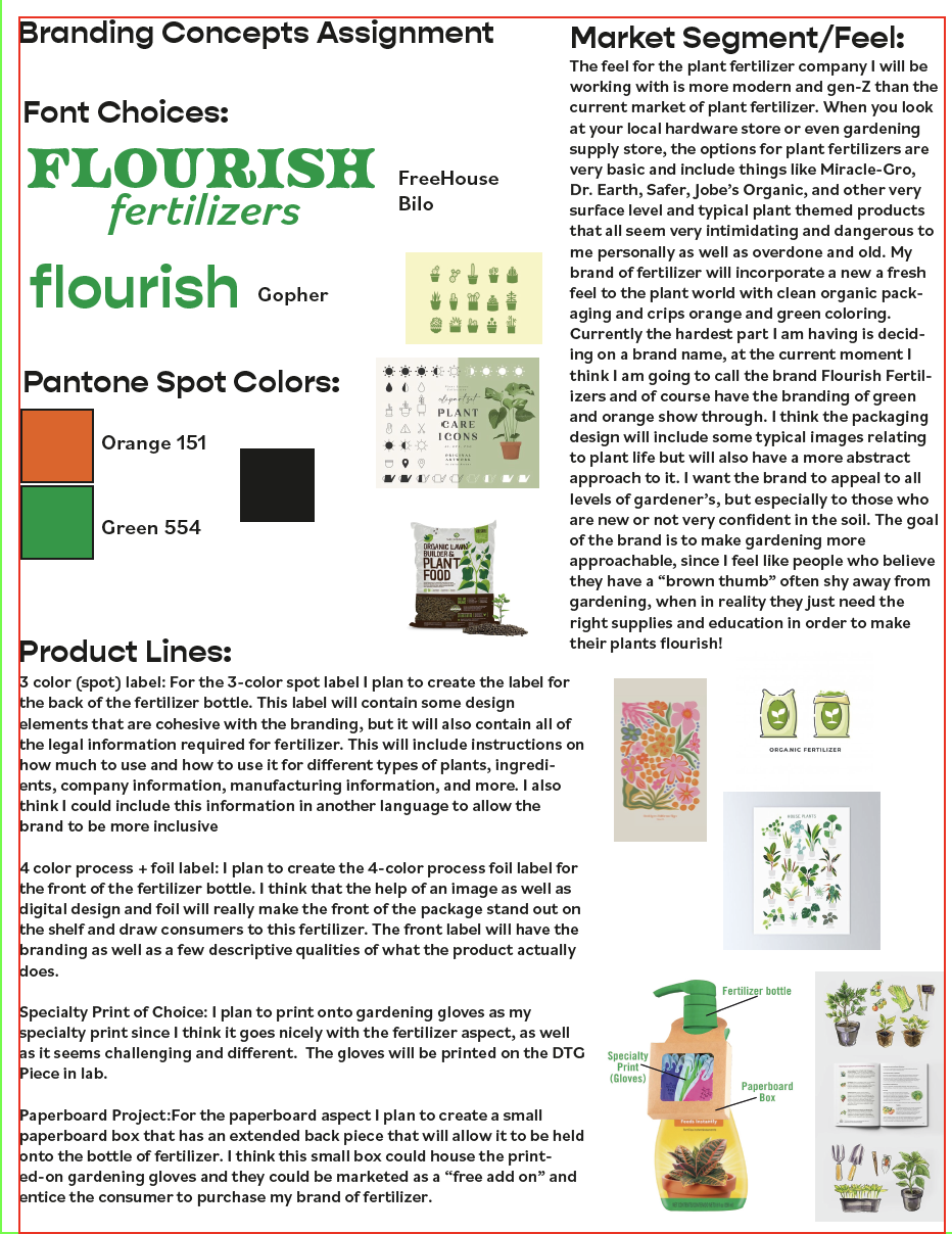
The beginning stages of designing a brand were rough personally, I created a branding concepts sheet with fonts and inspiration images included, but when it came time to actually design the logo and create a name for the fertilizer brand, I went in quite a few directions.

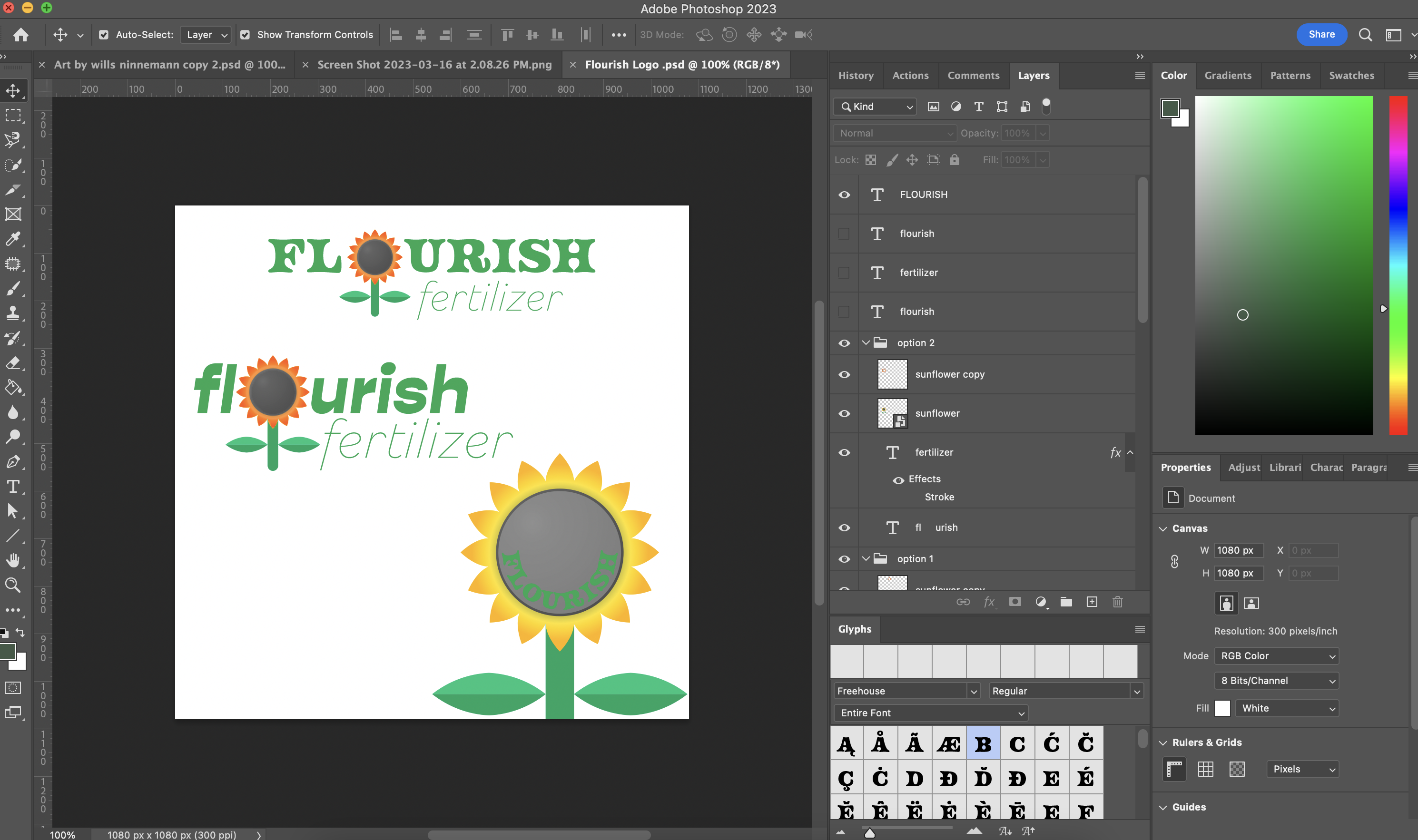
This image shows the first round of logos I created for the brand. They were pretty average as I was thinking of how to make things stick out from other competitors, but with a refreshing feeling. These design did not accomplish that goal, and when I reviewed them with my professor, we decided I needed to rethink the logo and take a look back at my original inspiration photos from the brand concept sheet seen above. She informed me it was still early enough in the process to rethink fonts and typography too, which really is where I began to make improvements first.

The inspiration for the logo came from a watercolored image found on Pinterest. I took inspiration from this image and began to draw the logo on my iPad in Procreate. After that design was solid I took the file from Procreate into Illustrator and began to image trace the logo and incorporate the process colors that I was assigned, orange and green. The logo really came together at this point and the typography was able to wrap it all together to create the new and fresh look on the fertilizer isle that I was going for.
At this point after creating a brand name and logo, it is time to move onto the five projects of the course. The students in the class were divided up into small groups to rotate through each of the projects because of limited equipment and machines. The project I was assigned to create first was the 3 color labels that were to be printed on the Comco press. Stay tuned to see how those turn out!
