GC 4060 Flourish Fertilizer Summary

With the semester at a close, as I reflect on this course and the work I produced, I can say that I am very pleased with everything. In the beginning I was skeptical when I was randomly assigned fertilizer to base my whole brand off of, and on top of that to only use orange and green as the main colors, but thankfully I can say things came together and there is a clear brand here now.
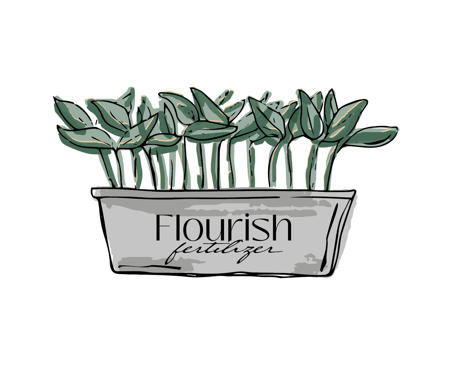
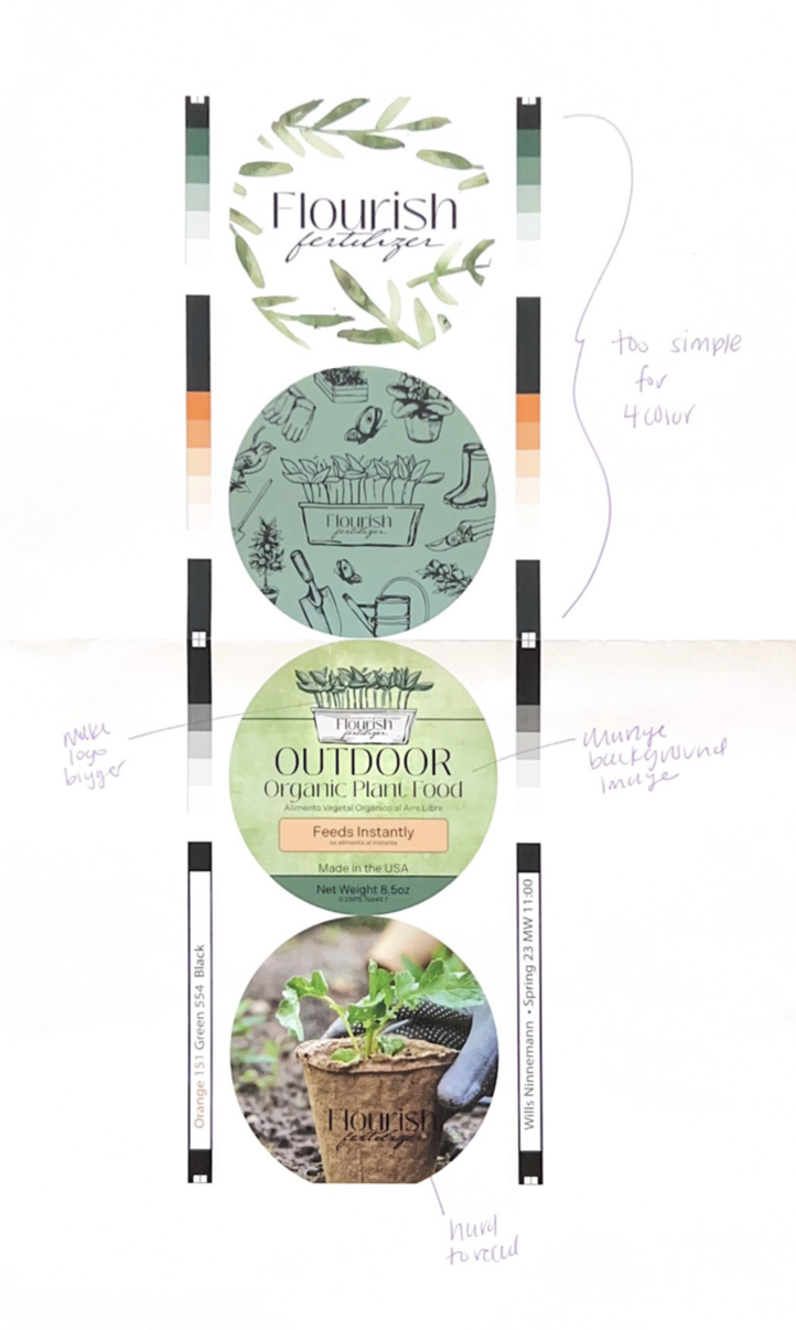
Flourish Fertilizer and the brand image took some time to thoughtfully create everything with the intent to market the fertilizer to customers in a hardware or lawn care store. I wanted this product to stand out on the shelf when both males and females are browsing the isles looking for a product to make their plants grow. The name, Flourish Fertilizer, came pretty quickly, but the part that took longer was the actual logo. I took inspiration from other fertilizer companies on what I didn’t want my logo to look like, and instead looked at Pinterest for a more updated take on plants and gardening. From Pinterest I found that I really wanted to go with a “water colored” image as the logo, and from there I was basically just a sketch away from the final product.
After the brand was created, I began working on each of the projects of the semester. These projects included: 3 color spot labels, 4 color process labels, a paperboard product, and a specialty project.
Project Overviews
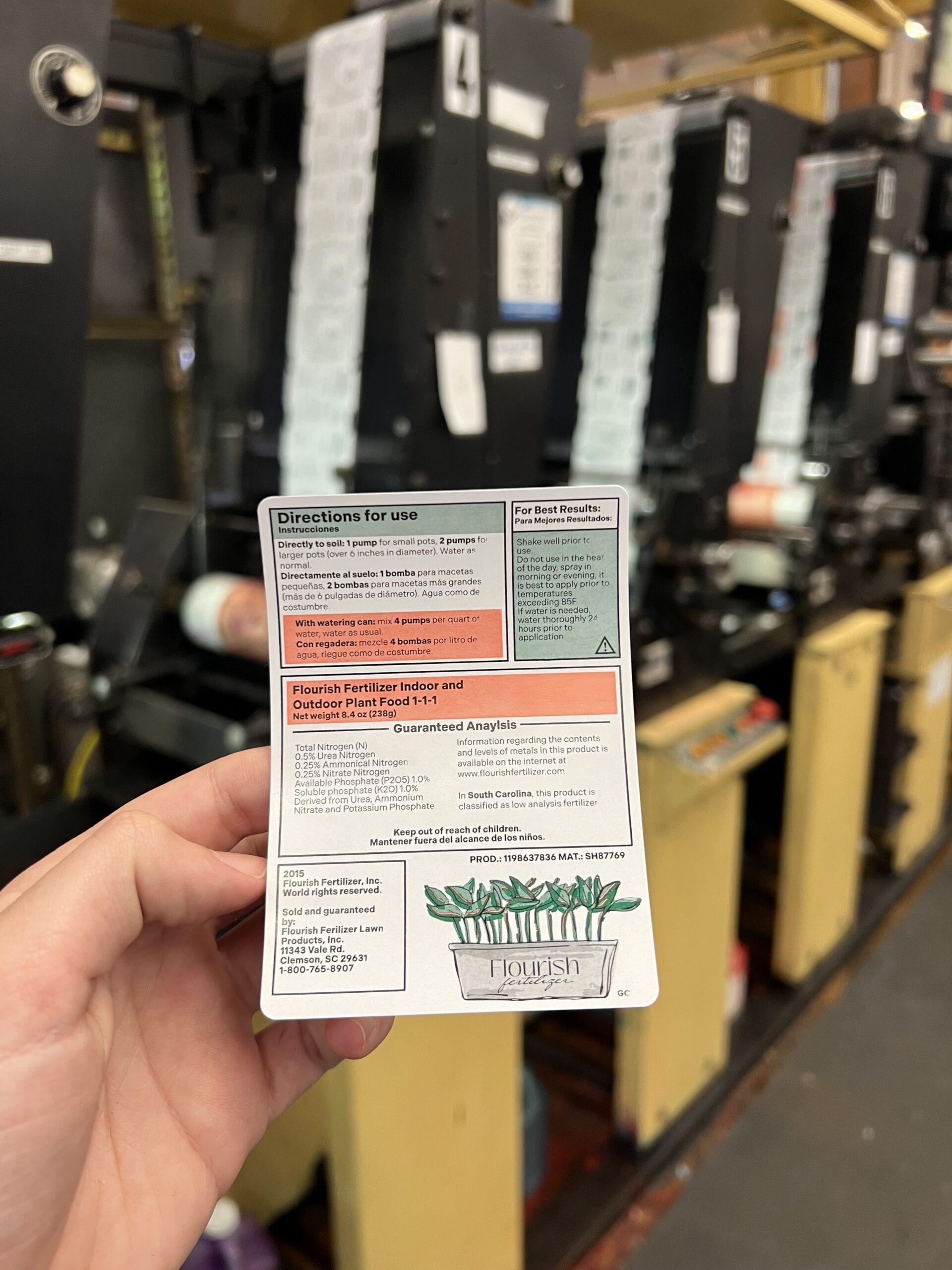
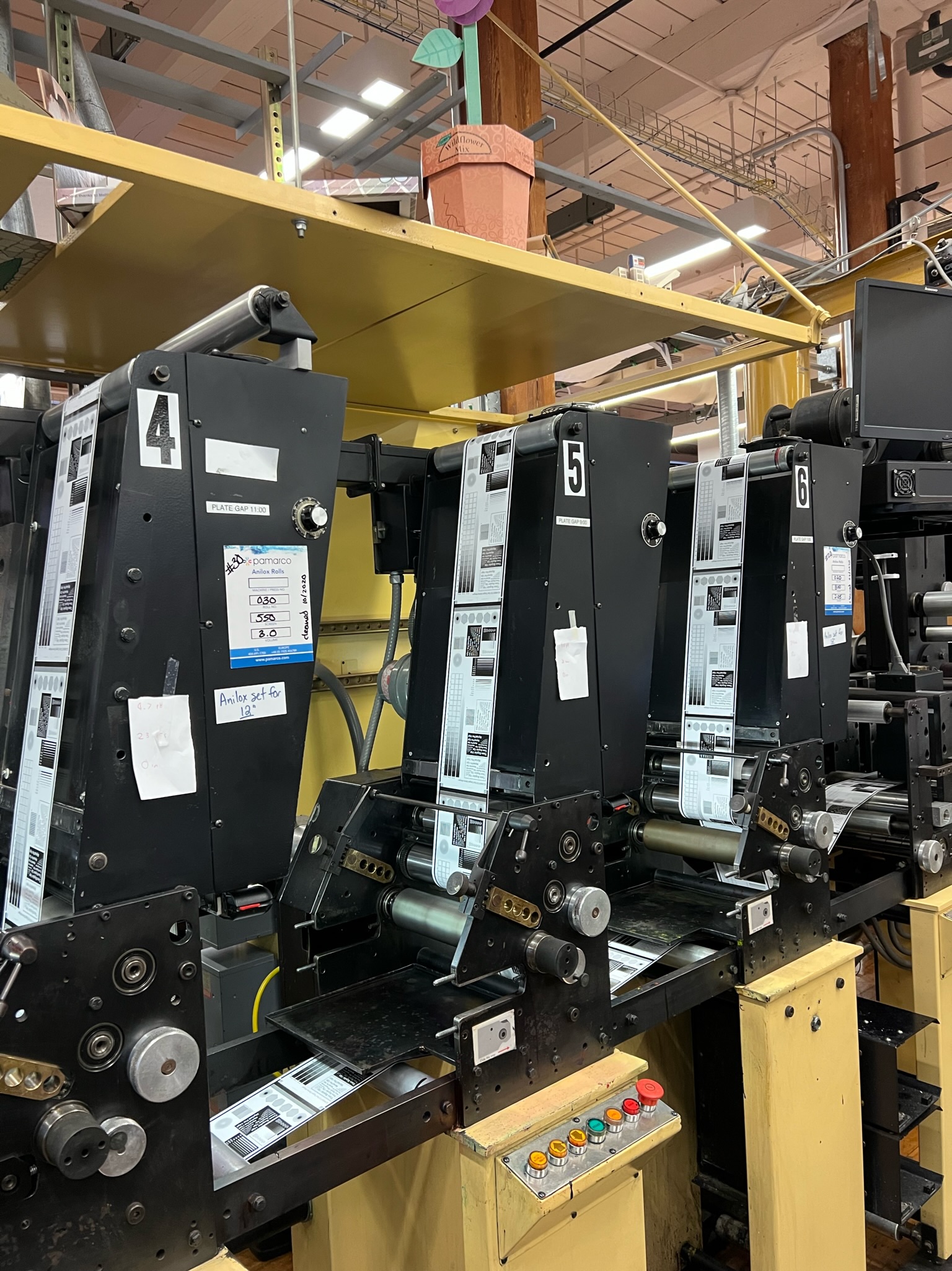
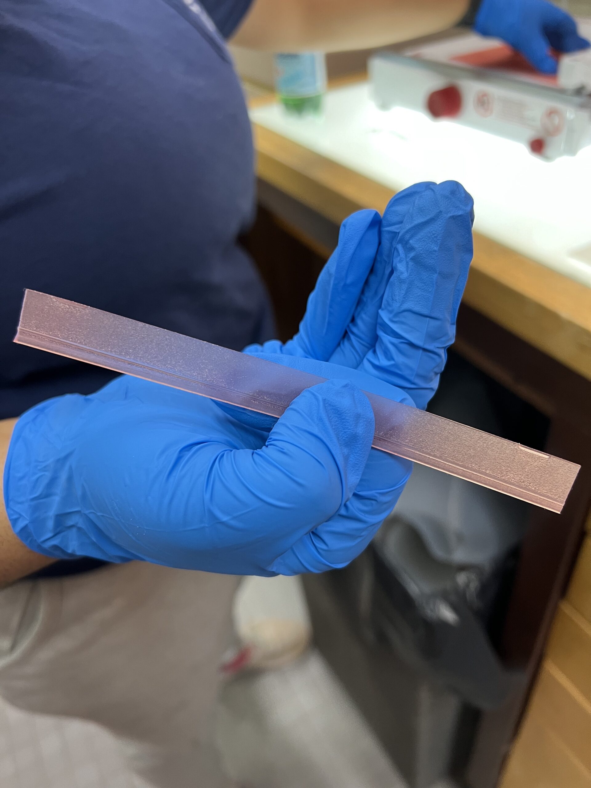
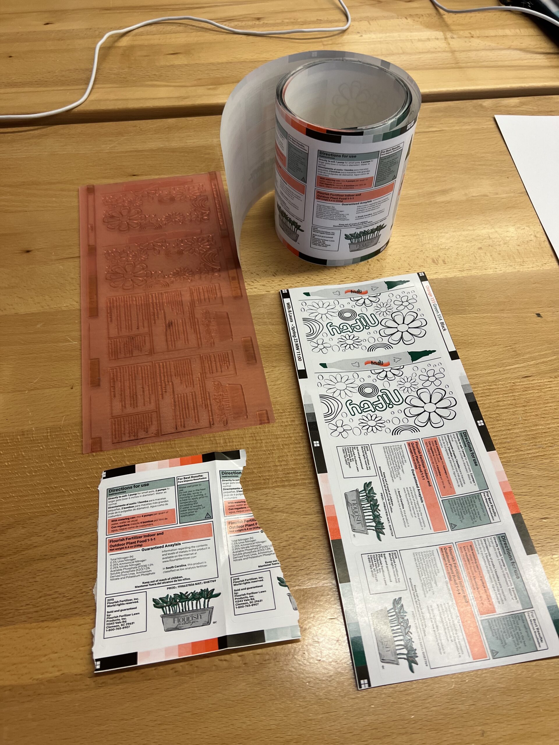
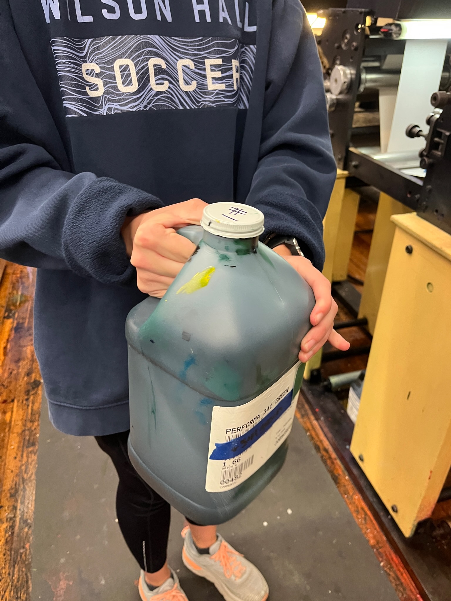
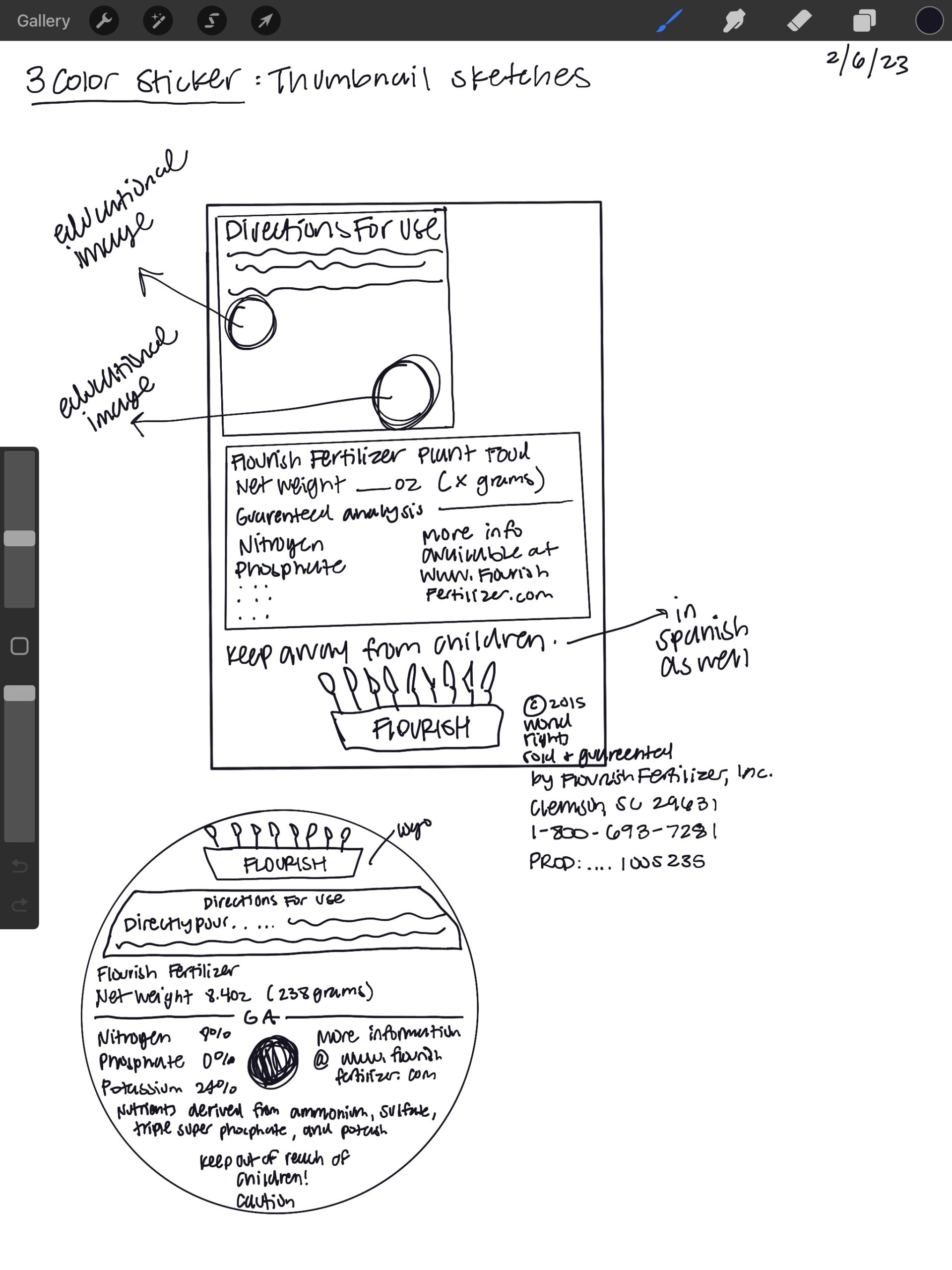
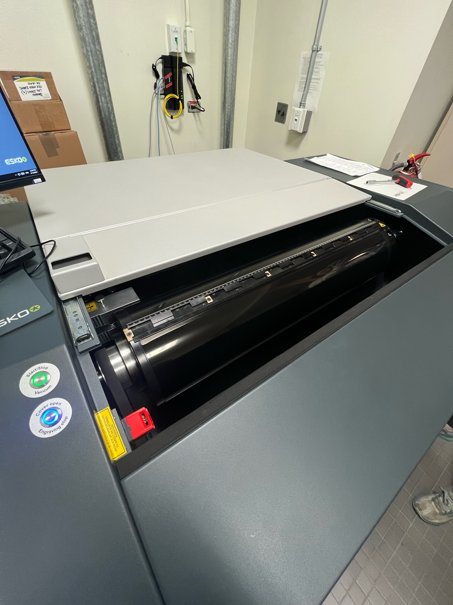
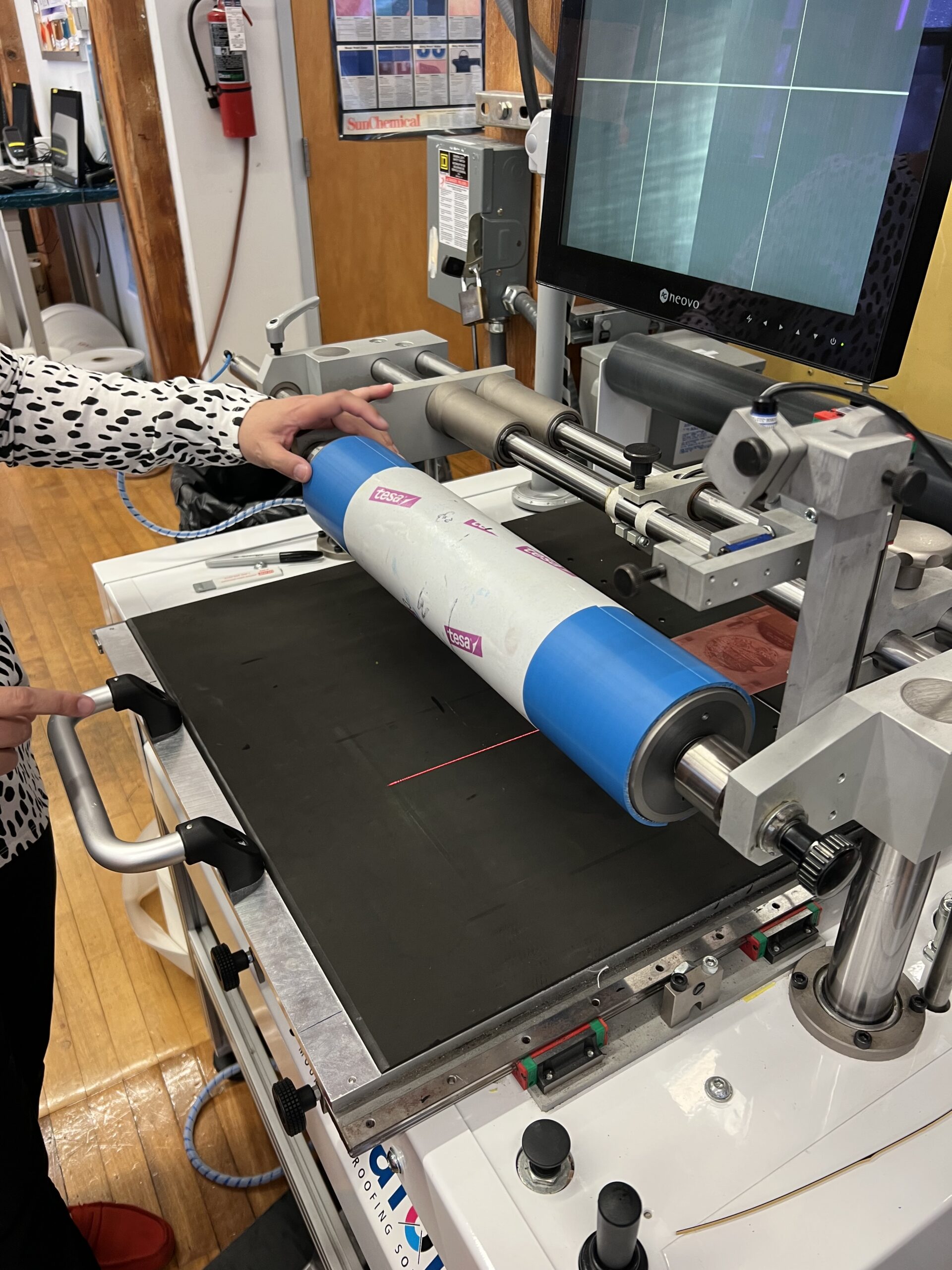
The 3 color spot labels were what I was most intimidated by and of course my track of was selected to print these first. The machine used to print these labels, the Comco, is large and an older machine which made me nervous. These labels were customizable to any size or shape I wanted which was nice and since I was only using three inks, black, orange, and green I though creating the back label for the fertilizer bottle would be best. Once actually in the printing process I found that it wasn’t as intimidating as I thought, and everything went smoothly! These labels are perfect for the back of the bottle and display all of the necessary information.

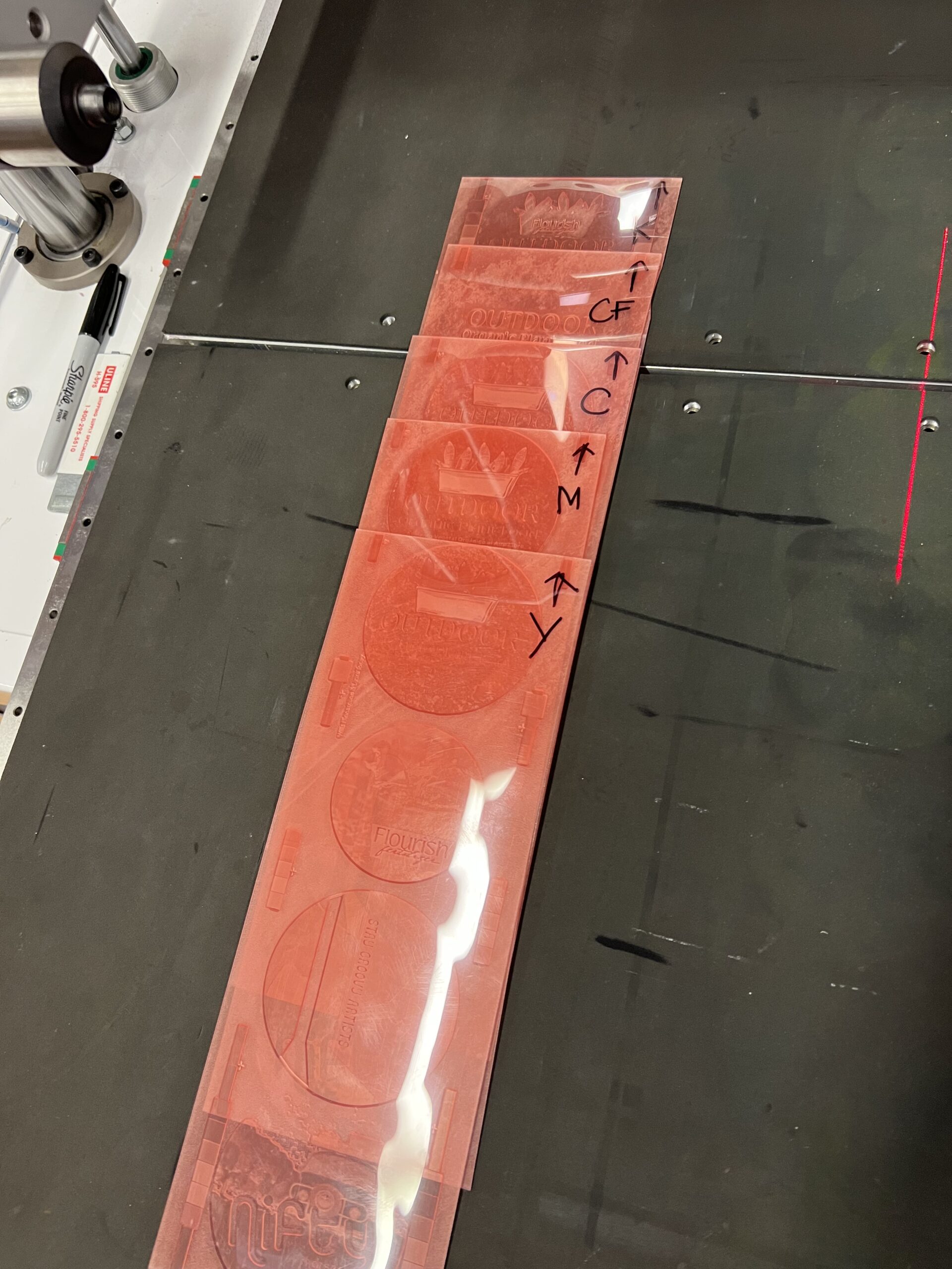
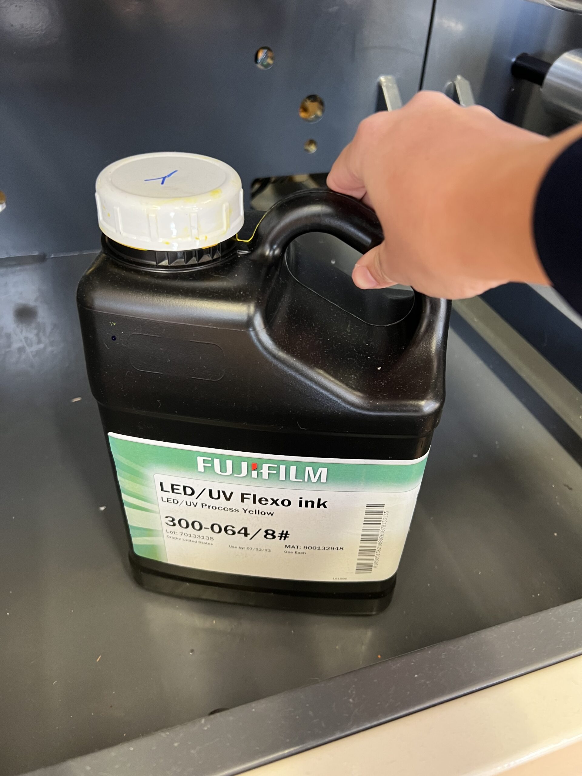
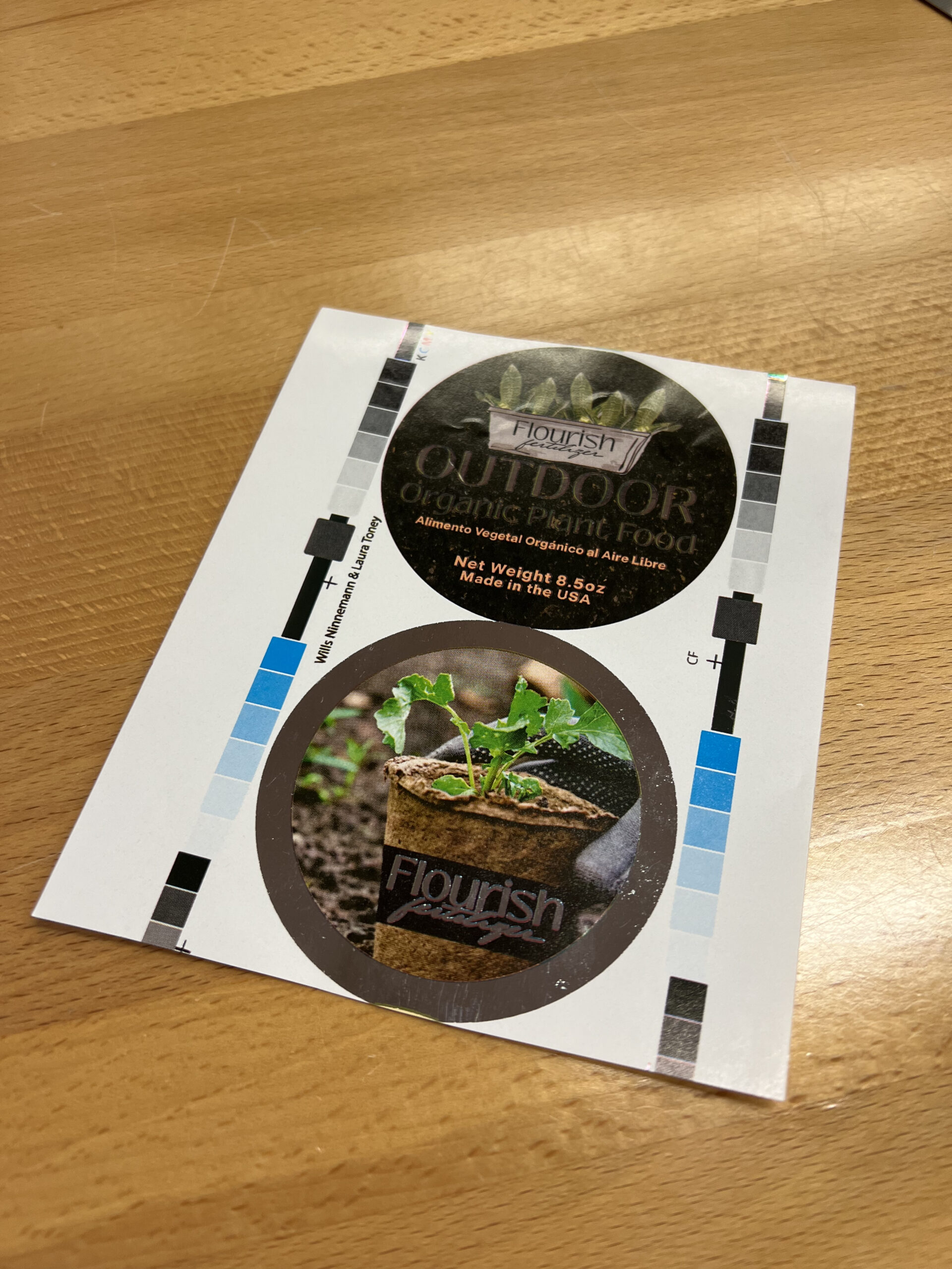
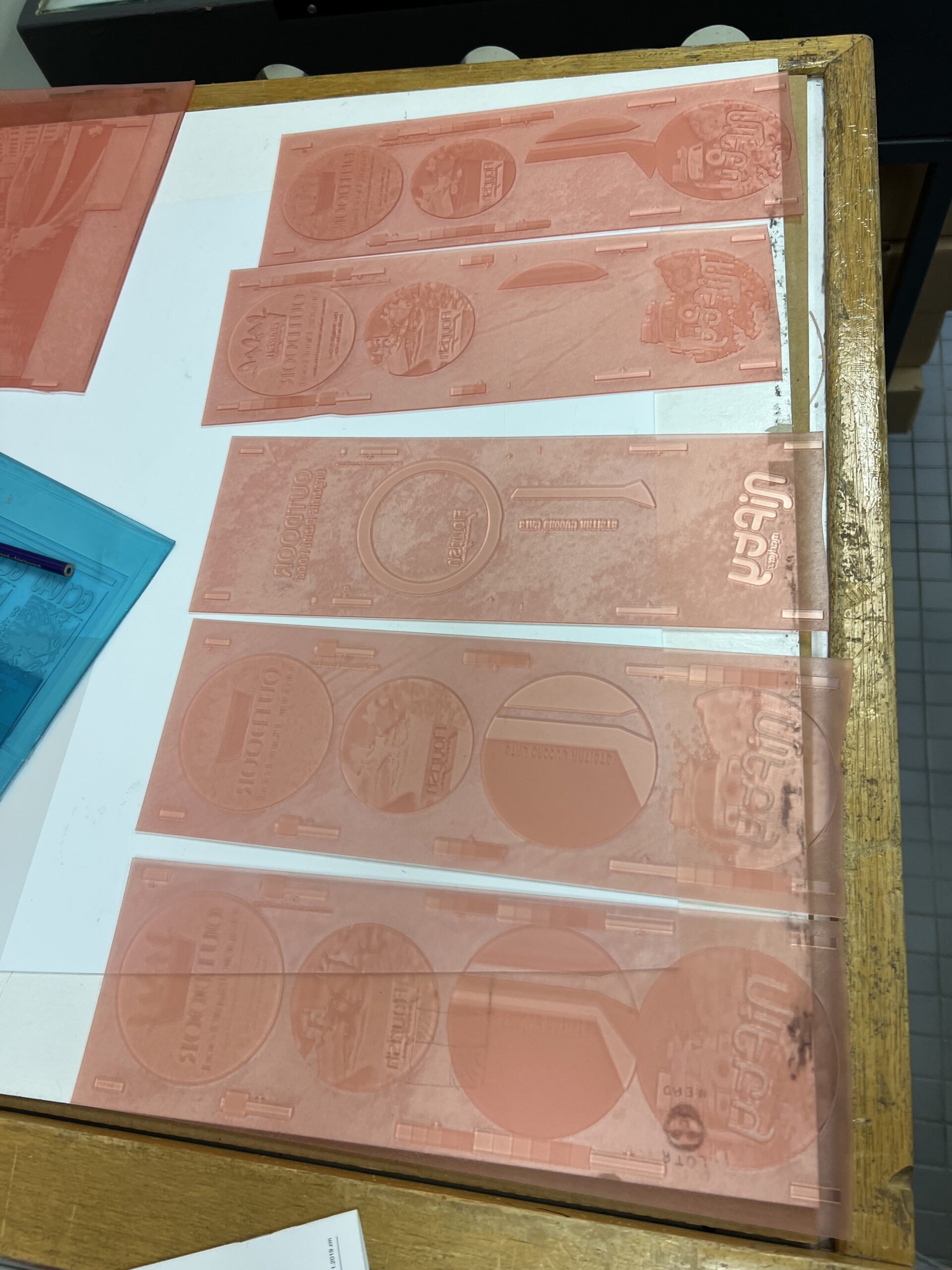
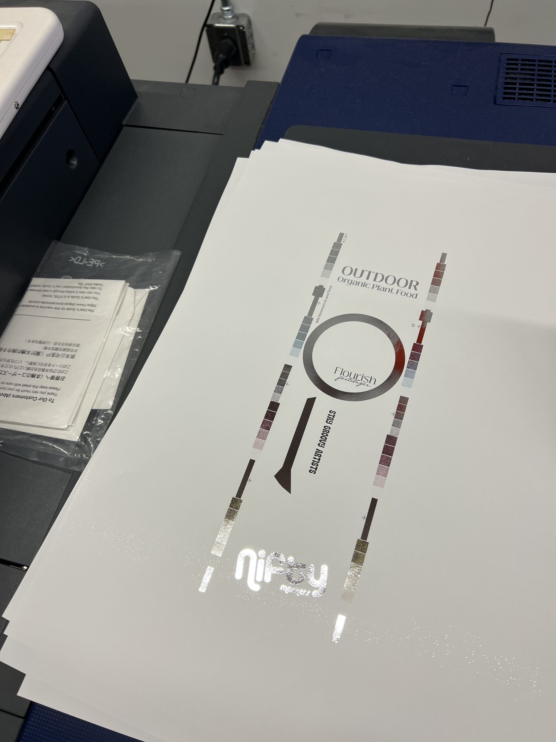
The 4 color process labels were the next project I was assigned to complete. These labels are printed on the Nilpeter with cyan, magenta, yellow, and black ink which allows for a lot more detail and colors than the 3 color labels that were printed with just black, green, and orange ink. Because of this I was able to incorporate images to these labels which was exciting. I chose to incorporate a dirt image as the background as well as change the logo slightly with real images of leaves which added a nice surprise to the front label. I also added a sleeked foil layer to the front label which really made it eye catching.

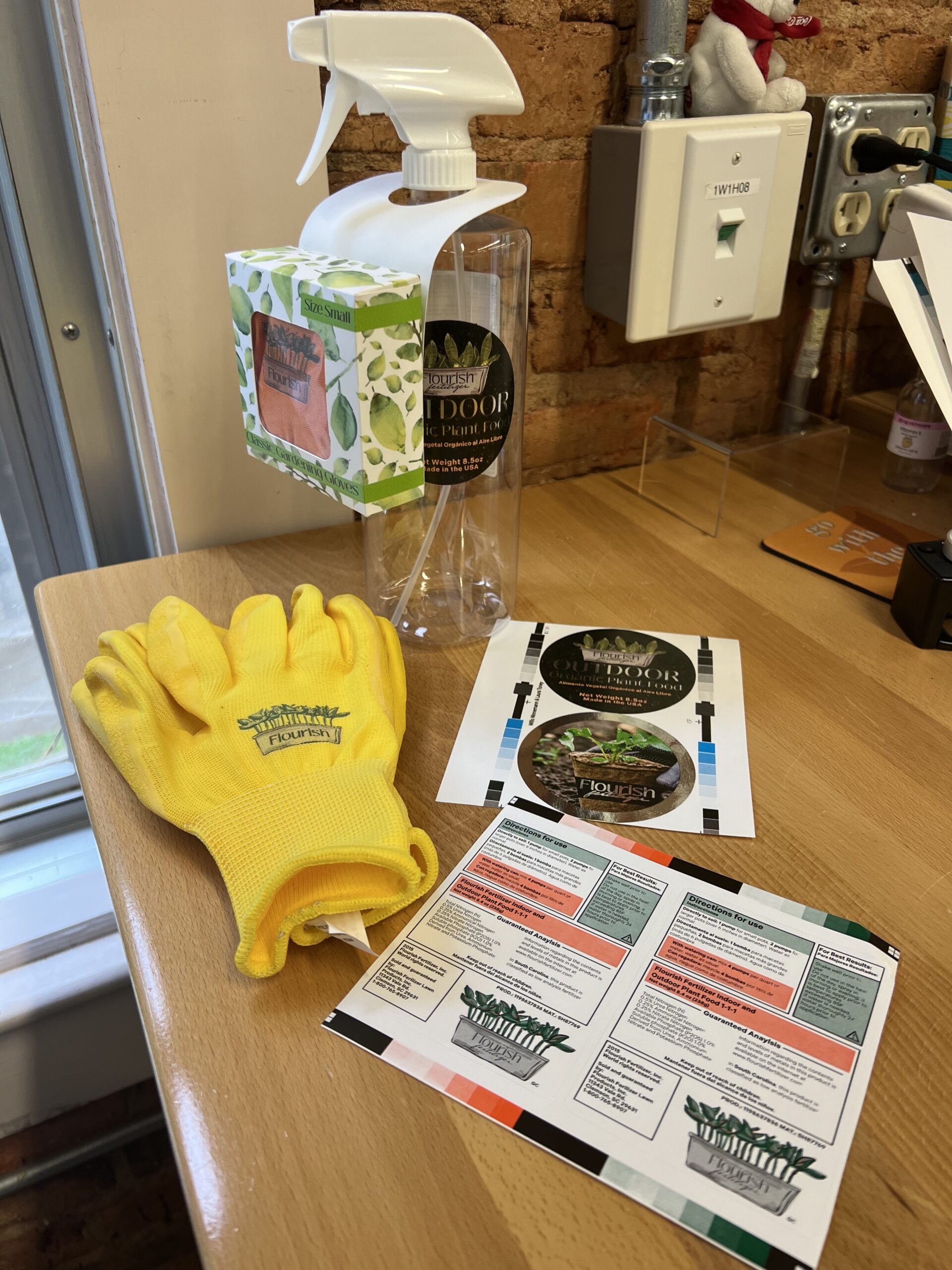
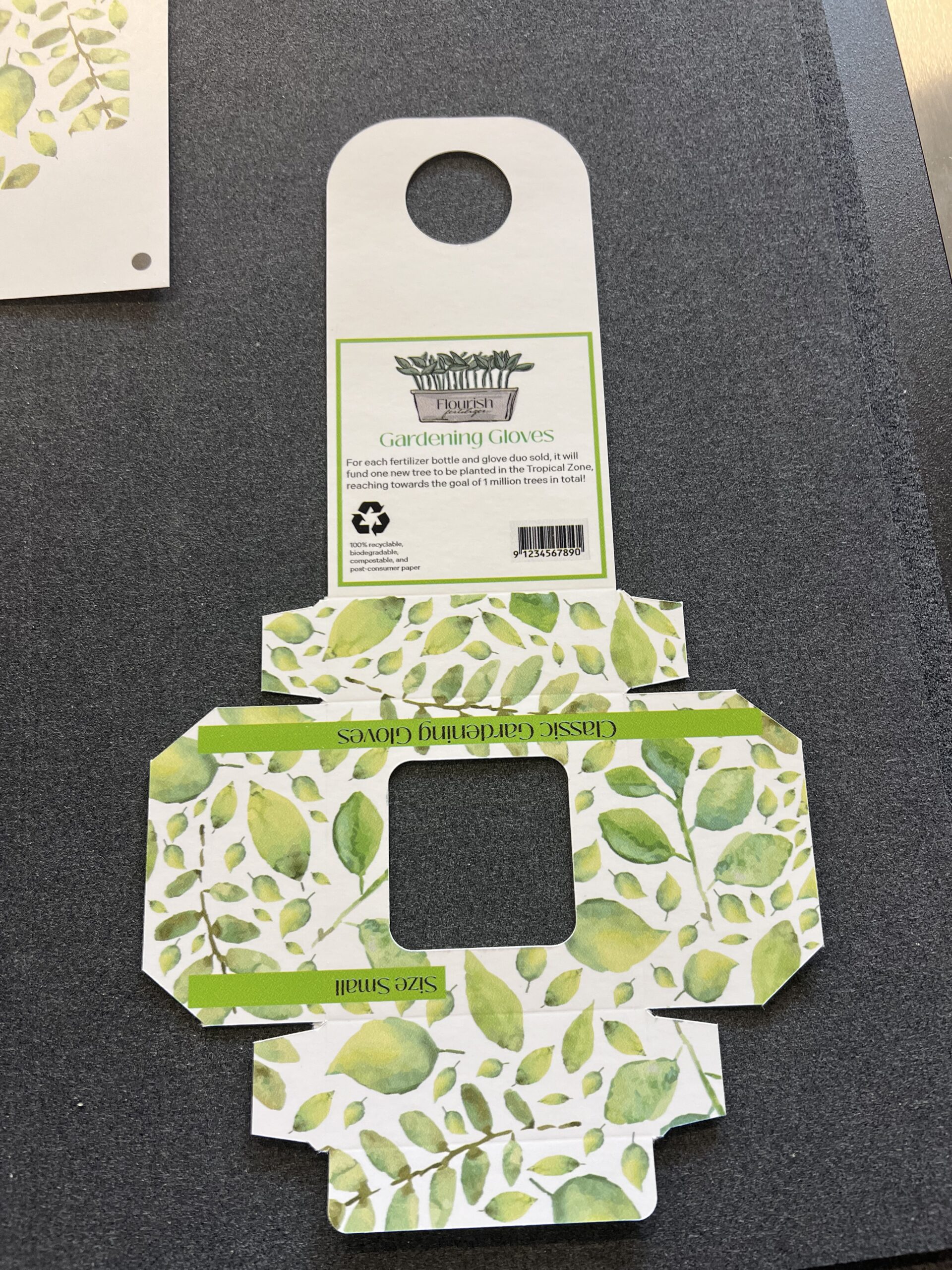
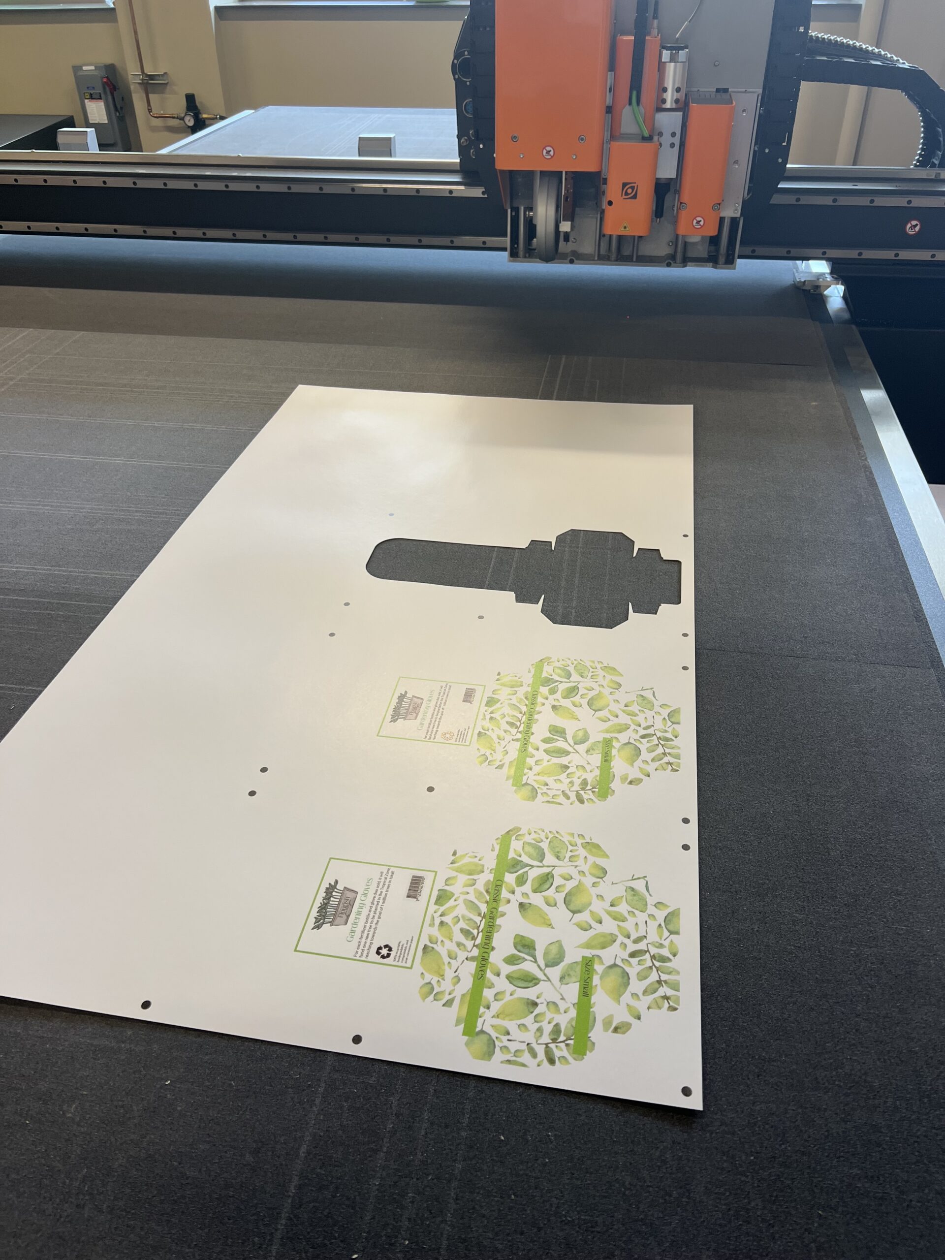
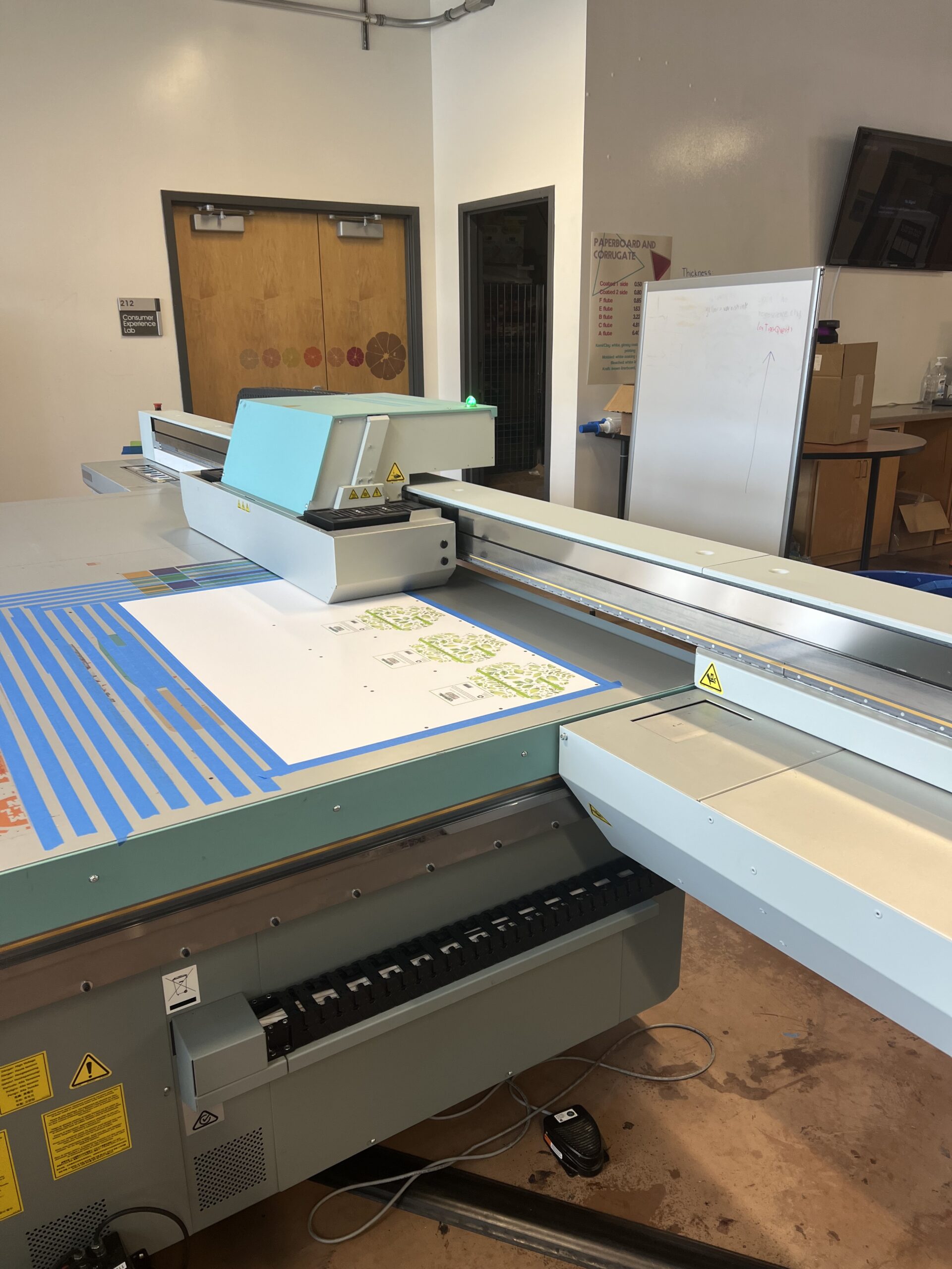
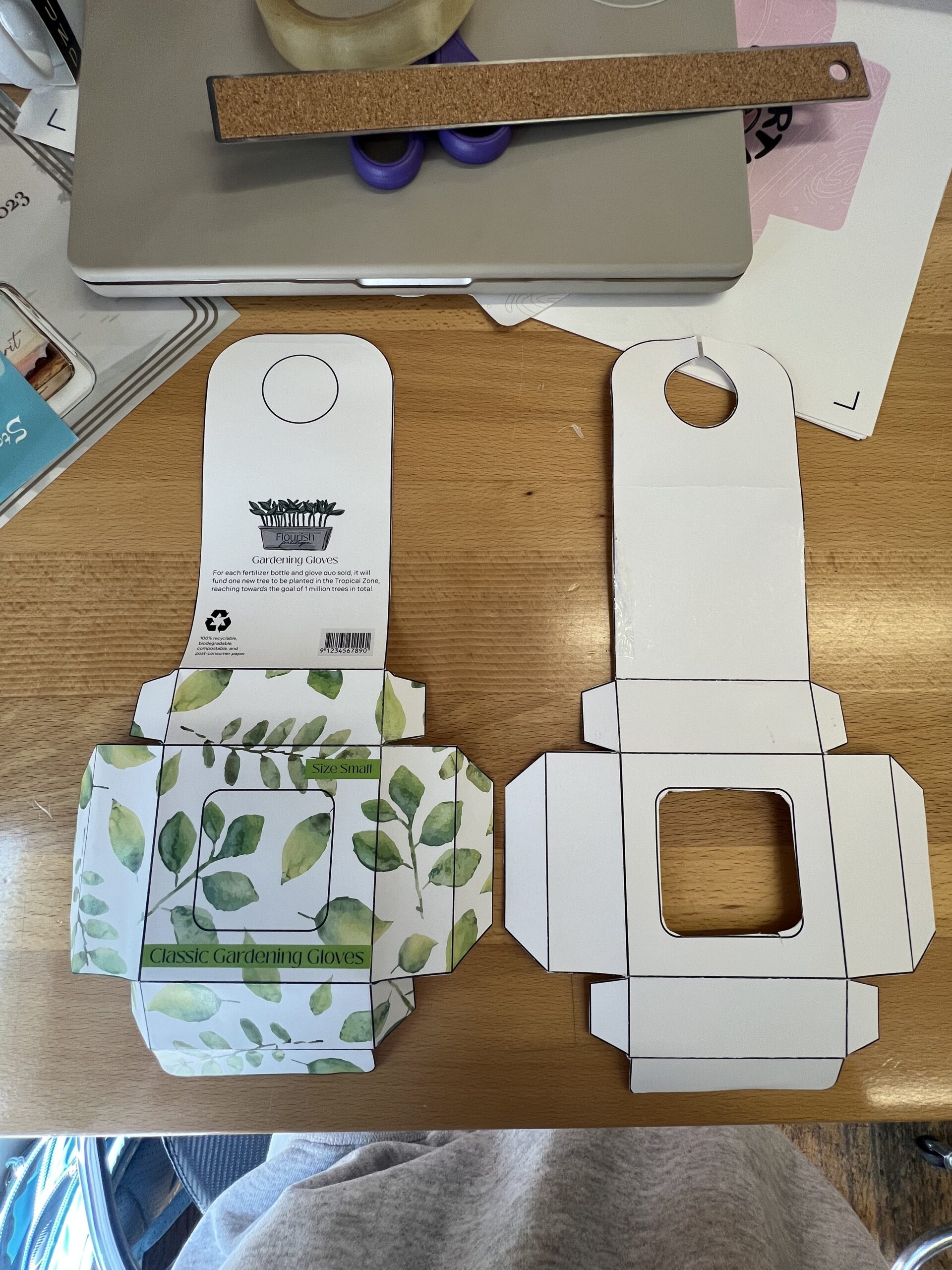
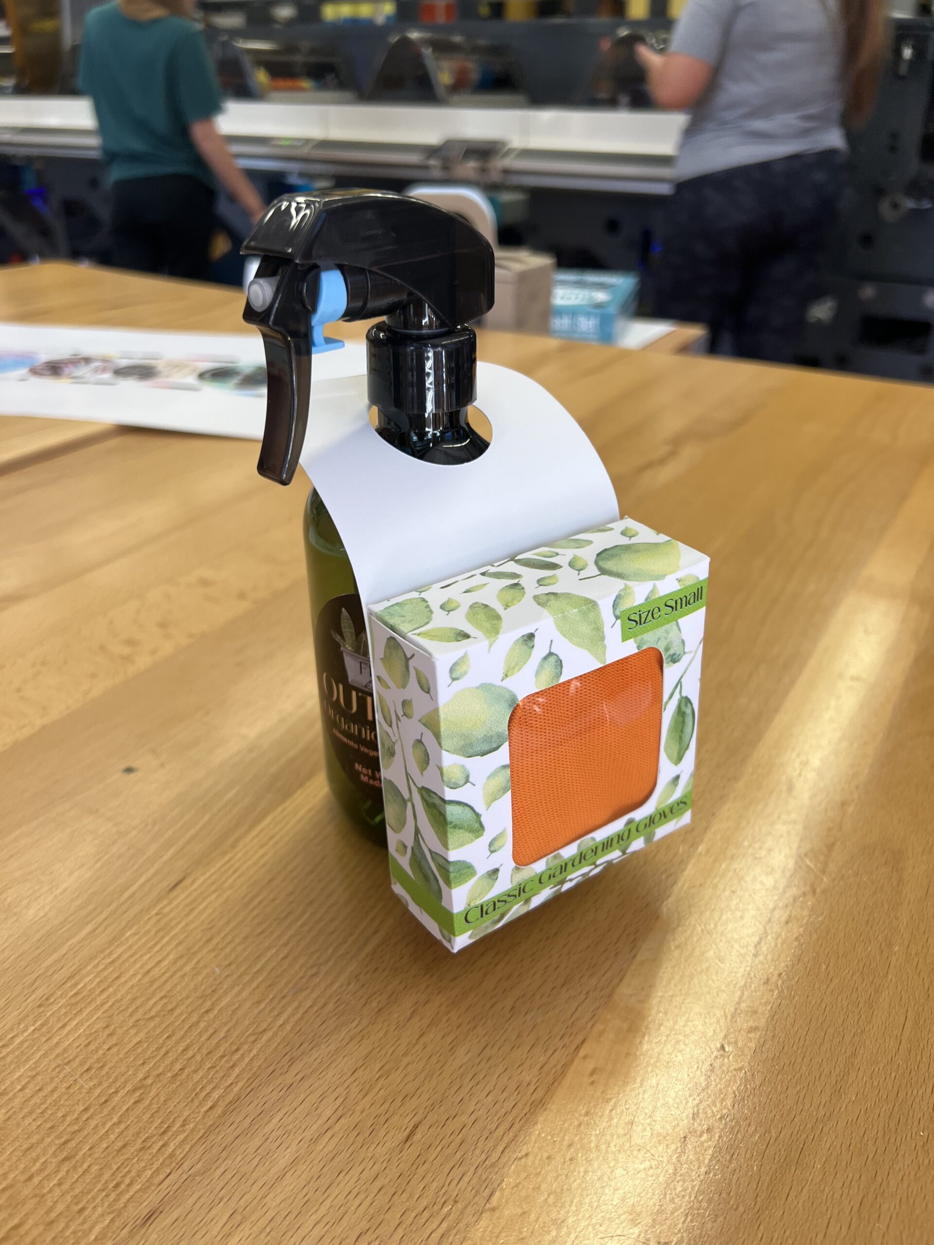
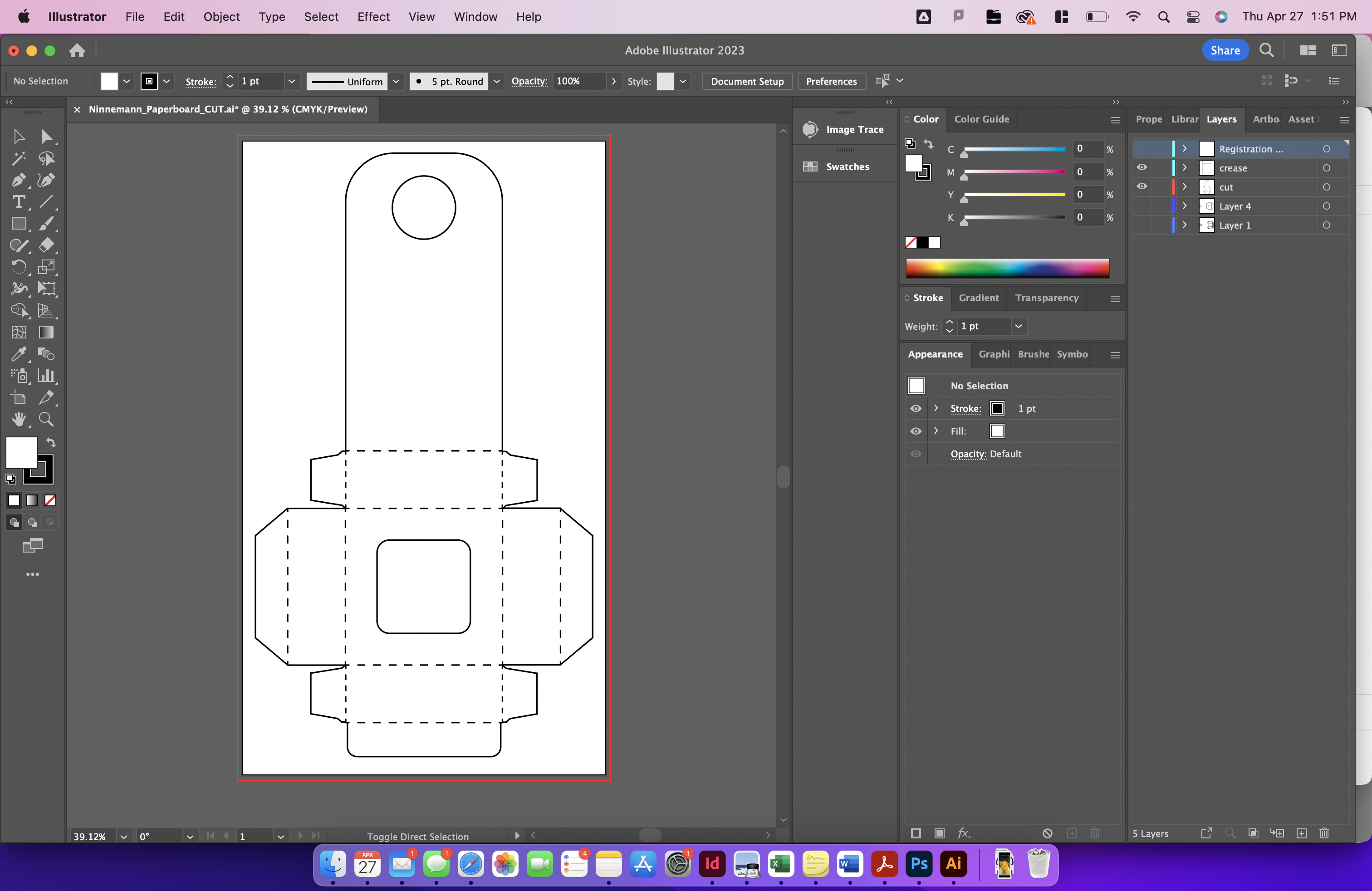
After the two labels were complete for the fertilizer bottle, I moved on to the paperboard project. I have to say this might be my favorite of the assignments just because I think adding this paperboard box with a pair of gloves inside is such a great marketing technique if the fertilizer bottle was on a store shelf. I think it shows the customer they are getting a bonus product for buying this specific bottle of fertilizer which would for sure catch my attention. I completely designed the actual box template as well as the leaf pattern seen on the paperboard box which was full of trial and error but turned out successful in the end! I also went to the Sonoco Prototyping lab on campus rather than our labs in Godfrey to print, score, and cut the paperboard box which was a great change of scenery and good experience.

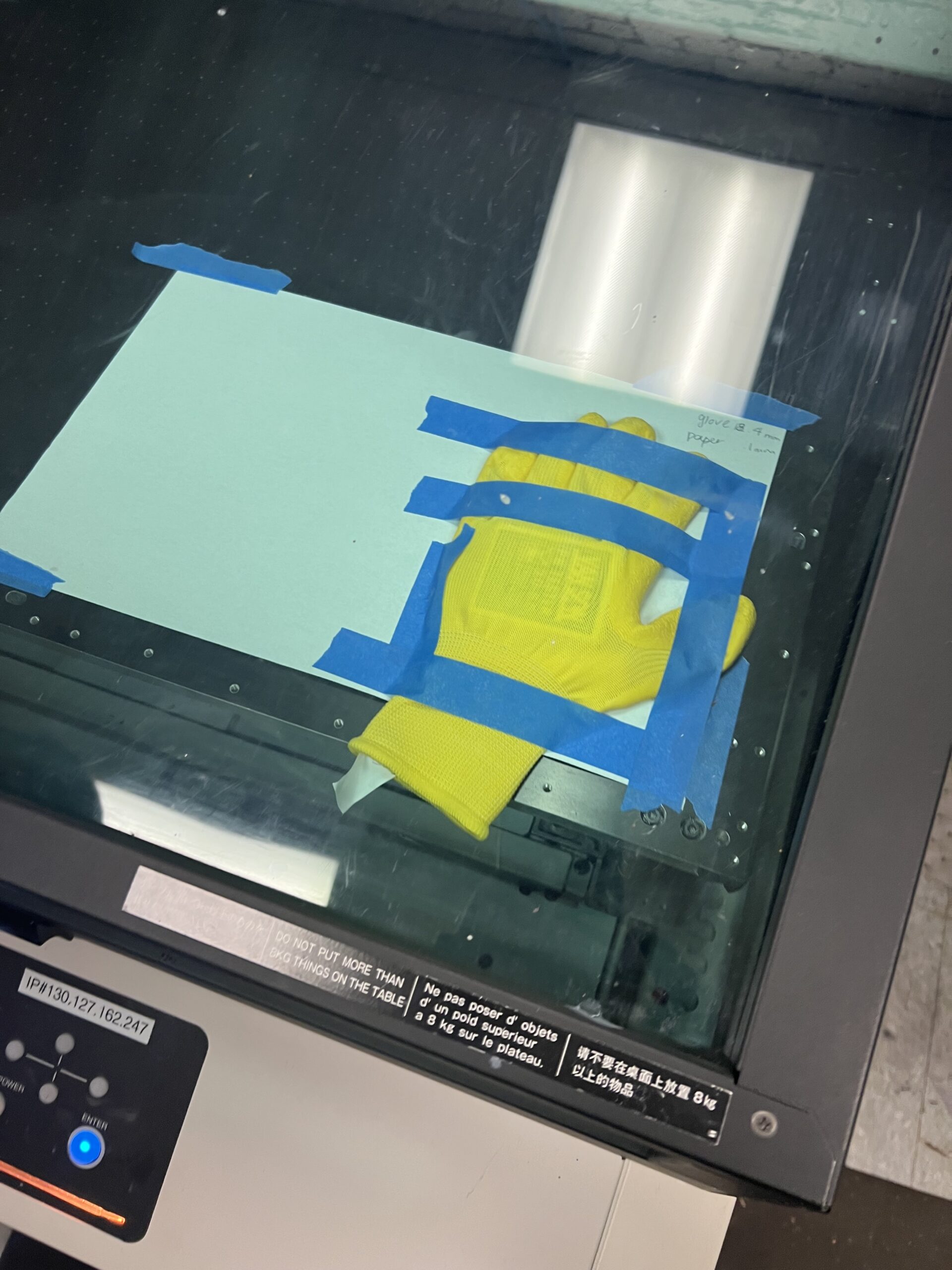
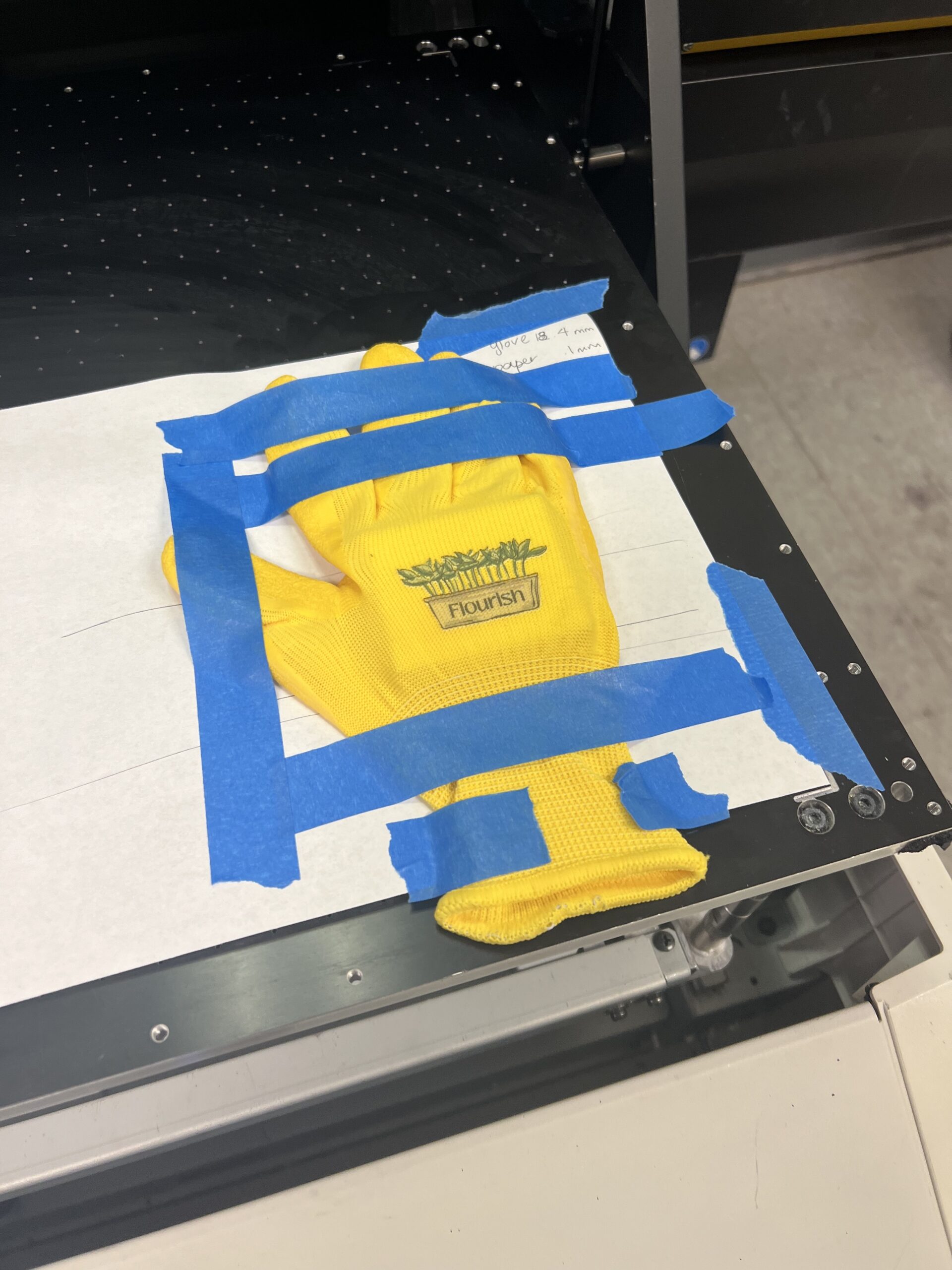
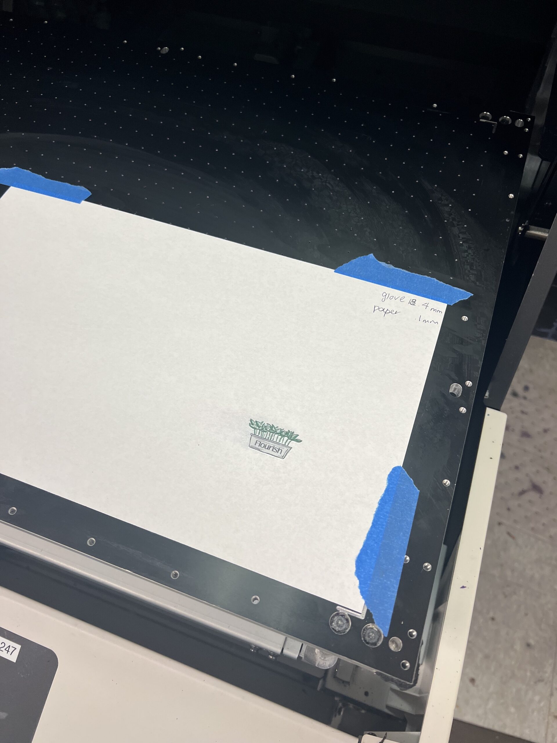
The final project of the course was a specialty print. This project had very loose guidelines and instructions which were to basically print onto an actual object that aligned with your brand and brand story. All semester I knew I wanted to print on garden gloves and was looking forward to trying it out. My professor and I weren’t sure how it would work but decided to try it. I chose to use the Milmaki UV inkjet printer in order to give the ink some ability to stretch on the glove fabric. The printing process ended up going well with slight adjustments made along the way to placement and size, but nothing that was crazy difficult to fix. In the end the gloves turned out better than I imagined, even better than my professor imagined too!

I truly was intimidated by this class as a whole going into the semester but can confidently say it has been one of my favorite classes at Clemson so far. I enjoyed how we had a lot of authority over the decisions we were making for our brand as well as when we were working on different projects. I enjoyed the almost work at your own pace aspect of the course which made it helpful to complete all of the work with other classes stacked on top. I also enjoyed the actual projects and variety of machines we got to learn how to use and use them well. I think the end results of my projects in the course speak for themselves and show that I was successful and enjoyed this course!
Use the left and right arrows to scroll through some images of the process!